Analytics
You can use Sweet Pricing Analytics to track mobile revenue over time, analyze purchasing behavior and filter data by user and device attributes.
Once you install Sweet Pricing in your mobile app, we will begin to process event data sent to our servers. You can track every time a user views your in-app store and every time a user makes a purchase.
This event data is critical to how segmented pricing and dynamic pricing works. We use this data to calculate how successful a particular pricing model is in comparison with your default pricing model.
But, you can also analyze this data from Sweet Pricing Analytics to get insight into purchasing behavior over time. You can use this data to compare purchase propensity between different groups of users, for example. That might help you hypothesize about which segmented pricing models might perform well in your app.
To view analytics, select your app from App Manager and view the 'Analytics' tab.
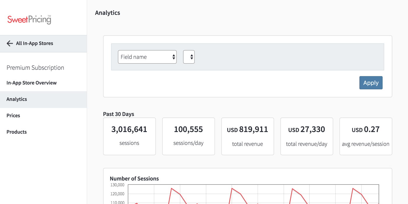
Apply Filters to Sweet Pricing Analytics
The first section of the Analytics page is the filters area. This tool allows you to filter the entire report by a range of user and device attributes, which can help you identify user segments and compare purchase propensity between groups of users.
To apply a filter, simply select the filter field from the dropdown. Then select a type of filter constraint to apply, such as 'is greater than or equal to'. The types of filter constraint available depends on the particular field you are filtering. You can combine multiple filters by clicking 'Add Filter'. Finally, click 'Apply' to update the report.
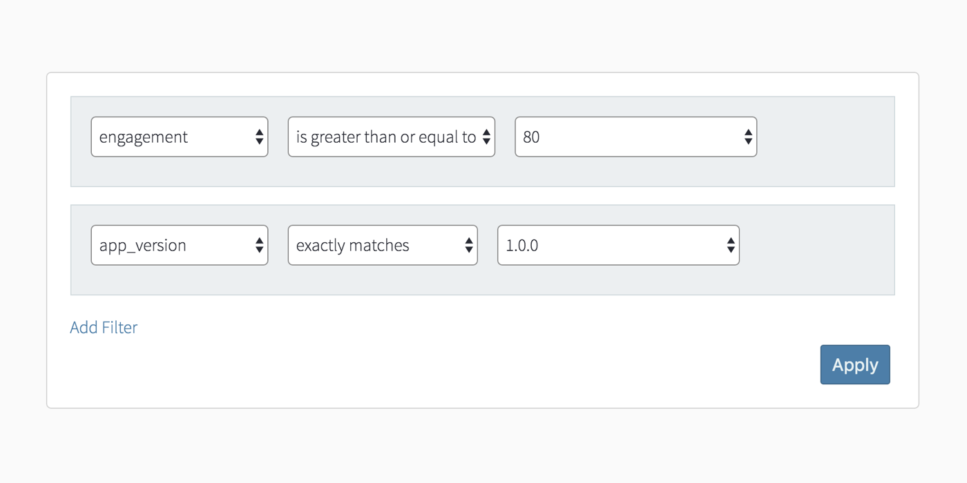
When you install Sweet Pricing into your mobile app, we automatically pull metadata about the device and user, and send this metadata alongside events. You can also provide your own custom attributes which will show up on the Analytics tab and be available for segmentation.
Furthermore, we calculate enriched attributes for every user session. This includes our engagement metric, which is a measure of mobile user engagement that you can use in reports and in segmentation rules.
Monitor Your App's Revenue With Key Performance Indicators
The Key Performance Indicators (KPI) section of Sweet Pricing Analytics gives you a quick overview of your app's revenue performance over the past 30 days. The KPIs we display also work with filters, so you can compare performance for particular groups of users.
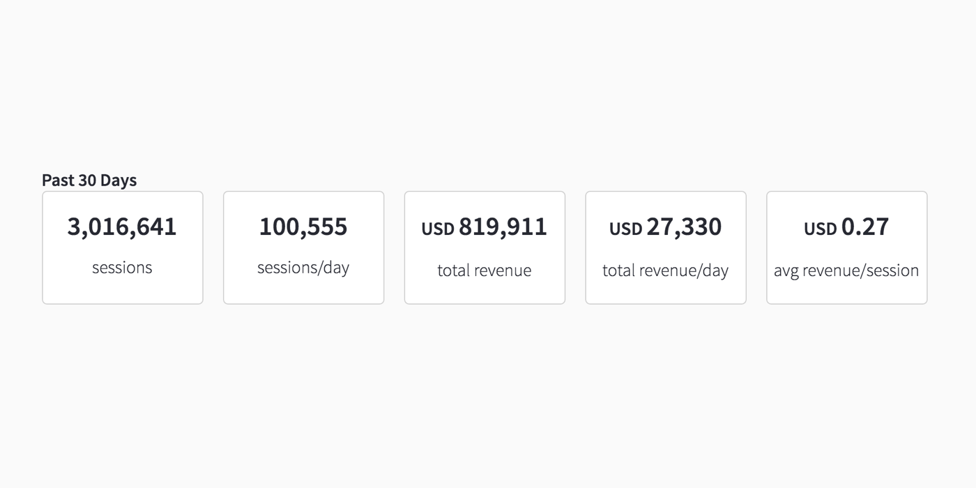
We show the following KPIs:
- total number of user sessions;
- average number of user sessions per day;
- total revenue;
- average revenue per day; and
- average revenue per user session.
Track Revenue Over Time
In addition to the KPIs, you can compare performance over time using the historical charts. These charts show a per-day breakdown of number of sessions, total revenue and average revenue per user session.

Perhaps the most useful chart on this page is the 'average revenue per user session' chart. This shows how much revenue your app is making for each session. So you can use this chart to see how well your price testing or segmented pricing efforts are paying off.